Branding, Brand Identity, Naming, Strategy, Merchandising, Marketing Support
Our Corner
I created the branding for a real estate company wanting to enter the self storage market.


-
The client aimed to maximize ROI on certain real estate properties by creating a new self storage brand. With heavy competition in the market, the branding needed to be unique and convey quality and safety. The branding also had to be designed with expansion in mind and appeal to customers with families.
-
To ensure the branding was both effective and competitive, I conducted extensive market research and a deep discovery process to understand the best direction for the brand. This research helped identify key market trends, customer preferences, and gaps in the current market.
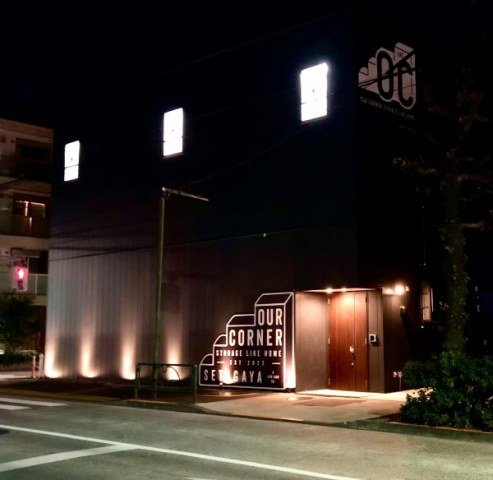
I developed the brand 'Our Corner' to convey a home away from home, providing a personalized space within the self storage area for families. The brand was designed to have a subtle and upscale appeal compared to its competitors. Strategically, the branding was created to resemble a restaurant or coffee shop at first glance, drawing more interest from prospective customers.
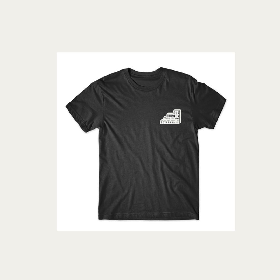
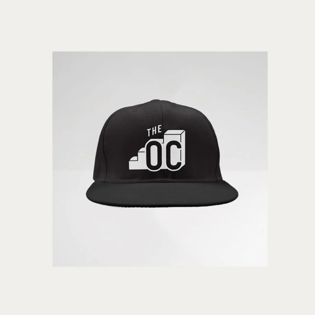
To enhance recognition, I also designed a shortened version of the branding, 'OC,' which would be easily recognizable. The comprehensive visual identity included elements for the website, social media usage, and marketing materials.
-
The first location opened with significant success and continues to maintain high occupancy rates. This success led to the opening of a second location, for which I adapted and localized the branding.


